|
There are lots of different types of graph:
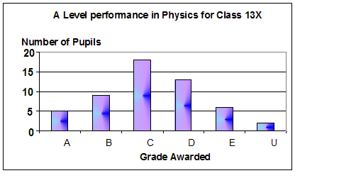
 Bar charts help you to see how two or more separate
entities (such as grades, years, different metals, animals, fish,
countries) compare to each other. It is for displaying categoric variables. Bar charts help you to see how two or more separate
entities (such as grades, years, different metals, animals, fish,
countries) compare to each other. It is for displaying categoric variables.
.
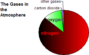
Pie charts help you to see how the 'whole' is made
up of various entities - to see the proportion of the contributions.
Line Graphs help you to see how two continuous variables relate
to one another.
For science experiments you usually have
to plot a 'best fit' line graph - a line graph can be a straight line or a curved line.
Graphs are a pictorial way of looking
at data from a table. You can instantly see the 'trend' of your results
and if you plot each set of data in a different colour on the same
graph, you can also see the 'spread' the results and tell at a glance
how precise your readings were.
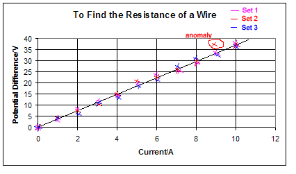
The graph above helps you to see the data gives you a general trend of direct proportionality and makes the ringed result stand out as an anomaly.
Plotting the spread of the results on the graph helps you to identify precision - not accuracy. Accuracy relates to how correct your results are - not your ability to get the same answer each time!
Sometimes examiners just want you to plot a single point for each measurement - then you need to plot your average result for that value. Such a graph does not indicate the precision of your results so it can be a good idea to include BOTH types of graph in a practical report - it gives you more to comment on in the results section.
When plotting a line graph you should:
Use a sharp pencil and
a 12" ruler.
Draw the whole graph in pencil first
and then when you are happy with it label the axes in ink, add a title
in ink and if you wish go over your points in ink or in a fine-tipped
felt or gel-ink pen.
Do NOT go over the line in ink.
You must:
choose
an appropriate scale so that
the:
(i) graph fills most of the page. It doesn't matter which way
round you position the graph paper
(ii) divisions on the axes make it easy to plot the points accurately. Choose factors of 2 or 5 NOT 3 or 7, or any other awkward number.
Give the
graph a title that explains what the experiment was about,
not simply 'A graph of temperature against time'.... that can
be gleaned from the labels on the axes.... something like 'Melting
ice' explains what you were doing as you recorded temperature
and time readings.
Put a key (explaining what each colour of line represents) if you choose to display more than one set of results on a single graph.
Label
the axes with the physical quantity and the unit
it was measured in. For example mass (kg)
Plot
the points accurately and clearly. The best way to mark a
point is to use a neat cross. If the line is then drawn so that
it obliterates the point you can still see where it is.
Draw an
appropriate best fit curved or straight line graph (NOT
DOT-TO-DOT graphs) to fit the data, Your points are NOT perfect...
your line gives an indication of the trend that they follow. Your
line should be smooth... no 'bumps' or 'wiggles'!
A straight line should be drawn with a ruler, not freehand
A curved line should
be drawn in a smooth 'swoop' through the points to indicate
the general shape.... no
'bumps' or 'wiggles'!
Interpreting your graph
If your
graph gives you a straight line it shows that the two physical
quantities you plotted are proportional. If the straight
line goes through the origin the graph indicates that they
are directly proportional.... i.e. if you double one quantity
the other will double too.
Any points
that are well away from the line are called anomalies.
They are probably due to experimental error. You should try to
think of how these anomalies could have occurred or what you could
do next time to avoid them happening.
The line
you have drawn can be used to make predictions. You can
draw a line parallel to one of the axes and then direct it towards
the other axis after it has reached your graph line of best fit.
This can be done from any value on either axis and allow you to
predict what a pair of values in the experiment would probably
be. In an exam always pencil
in these lines to show the examiner how you reached your answer.
Finding
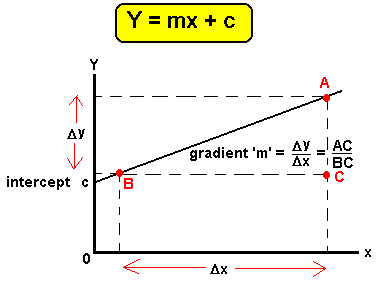
the gradient of a straight line graph
- The equation
of a straight line graph is
Here are the
steps to follow when finding the gradient of your graph:
- Draw
a LARGE (smallest
side greater than 8cm) triangle,
marking the verteces A,B and C and using dashed lines, as shown
above.
- Find what
value the sides AC and BC represent
by reading off the axes (don't forget their units!).
- Write out
the equation for the gradient EXACTLY
as shown on the diagram above - do NOT miss out steps!
- Calculate
the gradient value
- Write
the value
down in the same number of significant figures as it was possible
to read from the axes.
- Add
the unit
|